Views
Simple views
Overview

Reference
BasicViewDescriptor
BasicViewDescriptor
- Full name :
org.jspresso.framework.view.descriptor.basic.BasicViewDescriptor - Super-type :
DefaultIconDescriptor - Sub-types :
AbstractCardViewDescriptor,AbstractComponentViewDescriptor,AbstractTreeViewDescriptor,BasicActionViewDescriptor,BasicCollectionViewDescriptor,BasicCompositeViewDescriptor,BasicMapViewDescriptor,BasicPropertyViewDescriptor
This is the abstract base descriptor for all views. Its main purpose, since it cannot be used directly, is to factorize common properties.
| Property | Description |
|---|---|
actionMap
|
Assigns the view action map. An action map is generally represented as a toolbar attached to the view. The toolbar follows the structure of the action map :
|
background
|
Sets the background color of the UI component. The color must be defined using its string hexadecimal representation (0xargb encoded).
Default value is |
borderType
|
Sets the border type of the view. This is either a value of the
Default value is |
collapsed
|
Configures wether the view is collapsed by default. Some UI frontends allow the user to collapse
views when they are surrounded by a titled border. This is |
collapsible
|
Configures wether the UI frontend is alowed to collapse this view. Some UI frontends allow the user to collapse
views when they are surrounded by a titled border. This is |
font
|
Allows to customize the font used by the UI component. The font must be string encoded using the pattern "[name];[style];[size]" :
Default value is |
foreground
|
Sets the foreground color of the UI component. The color must be defined using its string hexadecimal representation (0xargb encoded).
Default value is |
grantedRoles
|
Assigns the roles that are authorized to use this view. It supports
"!" prefix to negate the role(s). Whenever the user is not
granted sufficient privileges, the view is replaced by an empty section at
runtime. Setting the collection of granted roles to |
modelDescriptor
|
Assigns the model descriptor backing the view. The model descriptor serves several purposes :
null value on the children as
an implicit model inheritance enablement. |
permId
|
Sets the permanent identifier to this application element. Permanent identifiers are used by different framework parts, like dynamic security or record/replay controllers to uniquely identify an application element. Permanent identifiers are generated by the SJS build based on the element id but must be explicitly set if Spring XML is used. |
preferredHeight
|
Allows to set a preferred height (in pixels) for the created peer UI component. This will override default and give hints to the UI layouting system. |
preferredSize
|
Sets the preferred size. |
preferredWidth
|
Allows to set a preferred width (in pixels) for the created peer UI component. This will override default and give hints to the UI layouting system. |
readOnly
|
Allows to set a view read-only, i.e. none of the view part will allow for updating the underlying model. This is mainly a shortcut to assigning an "always closed" writability gate. One difference though is that, since the framework knows that the view will never be updatable, it may take specific decisions to render properties in a slightly different way, e.g. instead of using a disabled text field, use a label.
Default value is |
secondaryActionMap
|
Assigns the view secondary action map. Same rules as the primary action map apply except that actions in this map should be visually distinguished from the main action map, e.g. placed in another toolbar. |
styleName
|
Assigns the style name to use for this view. The way it is actually leveraged depends on the UI channel. It will generally be mapped to some sort of CSS style name.
Default value is |
writabilityGates
|
Assigns a collection of gates to determine view writability. A view will be considered writable (updatable) if and only if all gates are open. This mechanism is mainly used for dynamic UI authorization based on model state, e.g. a validated invoice should not be editable anymore. View assigned gates will be cloned for each view instance created and backed by this descriptor. So basically, each view instance will have its own, unshared collection of writability gates. Jspresso provides a useful set of gate types, like the binary property gate that open/close based on the value of a boolean property of the view model. By default, view descriptors are not assigned any gates collection, i.e. there is no writability restriction. Note however that view actual writability is the combination of view and model writability. |
AbstractCardViewDescriptor
- Full name :
org.jspresso.framework.view.descriptor.basic.AbstractCardViewDescriptor - Super-type :
BasicViewDescriptor - Sub-types :
BasicCardViewDescriptor,EntityCardViewDescriptor,PropertyCardViewDescriptor
This descriptor serves as abstract base implementation for card view descriptor. A card view is a view stack made of children views (the cards) where only the view (card) at the top of the stack is visible. The actual child view to place on the top of the stack is dynamically determined based on the bound model. This card determination strategy depends on the concrete descriptor sub-types.
One might wonder why a card view is not considered as (and actually does not inherit from) a composite view. The difference is that composite views are used aggregate views that displays - hopefully - different parts (the children views) of the same model. A card view descriptor is rather used to make the same UI region display different views depending on different models (or different model states). Once the model is fixed, the card view behaves exactly as its top card.
One of the most important usage of card views is when it is combine as the detail in a master-detail view. The detail view may then change dynamically based on the selected master.
| Property | Description |
|---|---|
| This class does not have any specific property. |
BasicCardViewDescriptor
- Full name :
org.jspresso.framework.view.descriptor.basic.BasicCardViewDescriptor - Super-type :
AbstractCardViewDescriptor - Sub-types :
MobileCardViewDescriptor
Describes a multi-purpose card view that is configurable with a custom card determination strategy. Cards are registered with a name key that is used to retrieve the card to display based on the card selector selected name key.
| Property | Description |
|---|---|
cardNameSelector
|
Configures the card determination strategy. This delegate is responsible
for selecting the card name key based on the model bound to the view.
Every time the bound model changes, the card name selector is triggered to
select a new card. The names returned by the card name selector must match
the names under which the cards are registered. Whenever the card name
selector returns an unknown name, the card view displays an empty view. The
card name selector can optionally implement |
cardViewDescriptors
|
Registers the card views keyed by their name keys. The names used as key of
the |
MobileCardViewDescriptor
- Full name :
org.jspresso.framework.view.descriptor.mobile.MobileCardViewDescriptor - Super-type :
BasicCardViewDescriptor
A composite view descriptor that aggregates mobile views in cards.
| Property | Description |
|---|---|
forClientTypes
|
Sets for client types. |
position
|
Sets position. |
EntityCardViewDescriptor
- Full name :
org.jspresso.framework.view.descriptor.basic.EntityCardViewDescriptor - Super-type :
AbstractCardViewDescriptor - Sub-types :
MobileEntityCardViewDescriptor
This card view provides a simple card determination strategy that is based on the bound model type. This strategy pulls up the card whose model descriptor matches the type of the bound model.
| Property | Description |
|---|---|
viewDescriptors
|
Registers the list of card view descriptors. Every time the bound model changes, this list is iterated until a card with a matching model is found. The first matching card is displayed. Whenever no registered card matches, an empty view is displayed. |
MobileEntityCardViewDescriptor
- Full name :
org.jspresso.framework.view.descriptor.mobile.MobileEntityCardViewDescriptor - Super-type :
EntityCardViewDescriptor
This card view provides a simple card determination strategy that is based on the bound model type. This strategy pulls up the card whose model descriptor matches the type of the bound model.
| Property | Description |
|---|---|
forClientTypes
|
Sets for client types. |
position
|
Sets position. |
PropertyCardViewDescriptor
- Full name :
org.jspresso.framework.view.descriptor.basic.PropertyCardViewDescriptor - Super-type :
AbstractCardViewDescriptor - Sub-types :
MobilePropertyCardViewDescriptor
Describes a model-bound card view that is configurable with a model property used to determine the card yo display.
| Property | Description |
|---|---|
accessorFactory
|
Sets accessor factory. |
cardViewDescriptors
|
Registers the card views keyed by their name keys. The names used as key of
the |
propertyName
|
Sets the model property name used to determine the card name. |
MobilePropertyCardViewDescriptor
- Full name :
org.jspresso.framework.view.descriptor.mobile.MobilePropertyCardViewDescriptor - Super-type :
PropertyCardViewDescriptor
Describes a model-bound card view that is configurable with a model property used to determine the card yo display.
| Property | Description |
|---|---|
forClientTypes
|
Sets for client types. |
position
|
Sets position. |
AbstractComponentViewDescriptor
- Full name :
org.jspresso.framework.view.descriptor.basic.AbstractComponentViewDescriptor - Super-type :
BasicViewDescriptor - Sub-types :
BasicComponentViewDescriptor,MobileComponentViewDescriptor
Abstract class for component view descriptors.
| Property | Description |
|---|---|
labelFont
|
This property defines the font of the property labels. It might differ from the field component one. The font must be string encoded using the pattern "[name];[style];[size]" :
This property can be overridden on a field basis using an explicit property view definition.
Default value is |
labelsPosition
|
Instructs Jspresso where to place the fields label. This is either a value
of the
ELabelPosition.ASIDE, i.e. fields label next
to the property UI component. |
propertyViewDescriptors
|
This property allows for configuring the fields of the component view in a very customizable manner, thus overriding the model descriptor defaults. Each property view descriptor contained in the list describes a form field that will be rendered in the UI accordingly. For instance, a writable property can be made specifically read-only on this component view by specifying its property view descriptor read-only. In that case, the model remains untouched and only the view is impacted. Following the same scheme, you can assign a list of writability gates on a field to introduce dynamic field editability on the view without modifying the model. A last, yet important, example of column view descriptor usage is the role-based field set configuration. Whenever you want a field to be available only for certain user roles (profiles), you can configure a field property view descriptor with a list of granted roles. If the user doesn't have the field(s)required role, the forbidden field(s) simply won't be displayed. This allows for high authorization-based versatility. There are many other usages of defining field property view descriptors (like individual labels color and font), all of them being linked to customizing the form fields without impacting the model. |
renderedProperties
|
This is somehow a shortcut to using the
Whenever the property value is |
valueFont
|
This property defines the font of the property values. The font must be string encoded using the pattern "[name];[style];[size]" :
This property can be overridden on a field basis using an explicit property view definition.
Default value is |
BasicComponentViewDescriptor
- Full name :
org.jspresso.framework.view.descriptor.basic.BasicComponentViewDescriptor - Super-type :
AbstractComponentViewDescriptor
Component view descriptors are surely one of the most commonly used view
descriptors in Jspresso. It allows to implement advanced form-like views to
interact with a single component model. Component properties that are
displayed in the view are organized in an invisible grid. Each field
component is labelled with the property name it displays and labels can be
configured to be displayed aside or above their peer field. Property fields
can be configured to span multiple form columns. Component view offer various
straightforward customizations, but the most advanced and powerful one is
definitely the propertyViewDescriptors property tat allows to
fine-tune each component UI field individually.
The description property is used to compute view tooltips and support the following rules :
- if the description is a property name of the underlying model, this property will be used to compute the (dynamic) tooltip (depending on the actual model).
- if the description is not a property name of the underlying model, the the tooltip is considered static and the translation will searched in the application resource bundles.
- if the description is the empty string (''), the tooltip is de-activated.
- if the description is not set, then the toHtml property (see toHtml property on entities / components definition) is used as dynamic property. And the toHtml falls back to the toString if not set, which falls back to the 1st string rendered property if not set.
| Property | Description |
|---|---|
columnCount
|
Configures the number of columns on this component view. Property fields that are to be displayed in the view are spread across columns and rows following their defined order. Whenever a row does not contain enough empty cells to receive the next field (either because the last column has been reached or the next field has been configured to span multiple columns and there is not enough cells left in the current row to satisfy the span), a new row is created and the next field is added to the first column on the new row. Note that column count and span are defined in fields coordinates (the field including the property UI component + its label). The underlying grid is actually finer since it has to cope with the labels; but this is internal implementation details and Jspresso takes care of it, without the developer having to cope with labels placements. Default value is 1, meaning that all rendered fields will be stacked in a single column. |
horizontallyScrollable
|
This property allows to define the form horizontal scrolling behaviour. Whenever it is set to true, the corresponding UI component will install a horizontal scroll bar when the available horizontal space is not enough.
Default value is |
labelsHorizontalPosition
|
Configures the label horizontal position. There are special cases when the default label position has to be
overridden. This is either a value of the
Default value is |
propertyWidths
|
This property allows to simply define property spans in the underlying grid
without having to extensively define the
The
null, meaning all property fields have a span
of 1. |
renderedChildProperties
|
Whenever a rendered property is not scalar, this property allows to override which of the referenced component fields should be displayed :
Map which is :
A Please note that this is quite unusual to embed non-scalar properties directly in a component view. Although permitted, you won't have as much flexibility in the content layouting as you would have when using composite views; so the latter is by far recommended. |
verticallyScrollable
|
This property allows to define the form vertical scrolling behaviour. Whenever it is set to true, the corresponding UI component will install a vertical scroll bar when the available vertical space is not enough.
Default value is |
widthResizeable
|
This property allows to define the form horizontal fill behaviour. Whenever it is set to true, the corresponding UI component will fill all its available horizontal space.
Default value is |
MobileComponentViewDescriptor
- Full name :
org.jspresso.framework.view.descriptor.mobile.MobileComponentViewDescriptor - Super-type :
AbstractComponentViewDescriptor
A mobile form view descriptor.
| Property | Description |
|---|---|
excludedReadingProperties
|
Sets filtered reading properties. Allows to configure the properties that will be excluded from the read-only page. |
excludedWritingProperties
|
Sets filtered writing properties. Allows to configure the properties that will be excluded from the editor page. |
forClientTypes
|
Sets for client types. |
position
|
Sets position. |
AbstractTreeViewDescriptor
- Full name :
org.jspresso.framework.view.descriptor.basic.AbstractTreeViewDescriptor - Super-type :
BasicViewDescriptor - Sub-types :
BasicTreeViewDescriptor,MobileTreeViewDescriptor
This descriptor is use to design a tree view. The way to define a tree view
in Jspresso is a matter of assembling tree level descriptors
hierarchically. A tree level descriptor is a group of sibling nodes
that usually represent a component collection property. Each individual tree
node collection can be secured by using role-based authorization (i.e.
grantedRoles) on its descriptor.
| Property | Description |
|---|---|
childDescriptor
|
Configures the first tree level as being a single collection of sibling nodes. For instance, if the child tree level is mapped to a collection (collA) containing 5 elements (collA_Elt-1 to 5), the tree would look like :
 rootItem
   collA_Elt-1
   collA_Elt-2
   collA_Elt-3
   collA_Elt-4
   collA_Elt-5
In the example above, you should notice that there is no need for the tree to install an intermediary node to visually group the collection elements since the collection is alone on its level.
This property is only used if the |
childrenDescriptors
|
Configures the first tree level as being a list of collections of sibling nodes (subtrees). For instance, if the children tree levels are mapped to 2 collection properties (collA, collB) each containing 3 elements (collA_Elt-1 to 3 and collB_Elt-1 to 3), the tree would look like :
 rootItem
   collA
     collA_Elt-1
     collA_Elt-2
     collA_Elt-3
   collB
     collB_Elt-1
     collB_Elt-2
     collB_Elt-3
In the example above, you should notice intermediate collection property grouping nodes (collA and collB in italic). They automatically appeared to clearly group the tree nodes belonging to the different collections.
This property is only used if the |
displayIcon
|
Configures if the tree view should show icon based on the icon image url provider. Defaults to |
iconImageURLProvider
|
The icon image URL provider is the delegate responsible for inferring a
tree node icon based on its underlying model. By default (i.e. when
|
itemSelectionAction
|
This property allows to bind an action that gets triggered every time the selection changes on the tree view. The action context passed to the action when it is executed is the same as if it had been registered on the tree view. |
maxDepth
|
This property is used only when the tree (or sub-tree) is declared recursively, i.e. a tree level belongs to its own children hierarchy. Default value is 10, meaning that a maximum number of 10 levels can be nested. |
renderedProperty
|
This property allows to define the model property used to label the root node.
This property is only used if the |
rootSubtreeDescriptor
|
This property allows to explicitly define the tree root level as any other level. Most of the time, you will prefer using the following shortcut properties :
rootSubtreeDescriptor is explicitly set, the
properties above are simply ignored since all values are determined from
rootSubtreeDescriptor. |
rowAction
|
Registers an action that is implicitly triggered every time a row is activated (e.g. double-clicked for current UI channels) on the collection view UI peer. The context of the action execution is the same as if the action was registered in the view action map. |
BasicTreeViewDescriptor
- Full name :
org.jspresso.framework.view.descriptor.basic.BasicTreeViewDescriptor - Super-type :
AbstractTreeViewDescriptor - Sub-types :
This descriptor is use to design a tree view. The way to define a tree view
in Jspresso is a matter of assembling tree level descriptors
hierarchically. A tree level descriptor is a group of sibling nodes
that usually represent a component collection property. Each individual tree
node collection can be secured by using role-based authorization (i.e.
grantedRoles) on its descriptor.
| Property | Description |
|---|---|
expanded
|
Setting this property to |
MobileTreeViewDescriptor
- Full name :
org.jspresso.framework.view.descriptor.mobile.MobileTreeViewDescriptor - Super-type :
AbstractTreeViewDescriptor - Sub-types :
This descriptor is use to design a tree view. The way to define a tree view
in Jspresso is a matter of assembling tree level descriptors
hierarchically. A tree level descriptor is a group of sibling nodes
that usually represent a component collection property. Each individual tree
node collection can be secured by using role-based authorization (i.e.
grantedRoles) on its descriptor.
| Property | Description |
|---|---|
forClientTypes
|
Sets for client types. |
position
|
Sets position. |
showArrow
|
Sets show arrow. |
BasicActionViewDescriptor
- Full name :
org.jspresso.framework.view.descriptor.basic.BasicActionViewDescriptor - Super-type :
BasicViewDescriptor - Sub-types :
MobileActionViewDescriptor
This type of view allows to make an action available as a view and thus participate in the UI composition as a visual component. An action view can then be embedded in surrounding a composite view. It literally takes the action away from the toolbar/context menu it is located when registered in an action map and makes it a primary citizen of the UI.
| Property | Description |
|---|---|
action
|
Assigns the action to display as a view. The action will typically be
rendered as a button in the UI. Whenever you want to size the icon used to
display the action (and thus the button peer), you might use the
|
actionList
|
Assigns the action list to display as a view. The action will typically be rendered as a button bar in the UI. |
renderingOptions
|
Indicates how the action should be rendered. This is either a value of the
Default value is |
MobileActionViewDescriptor
- Full name :
org.jspresso.framework.view.descriptor.mobile.MobileActionViewDescriptor - Super-type :
BasicActionViewDescriptor
A mobile action view descriptor.
| Property | Description |
|---|---|
forClientTypes
|
Sets for client types. |
position
|
Sets position. |
BasicCollectionViewDescriptor
- Full name :
org.jspresso.framework.view.descriptor.basic.BasicCollectionViewDescriptor - Super-type :
BasicViewDescriptor - Sub-types :
AbstractListViewDescriptor,AbstractRepeaterViewDescriptor,BasicTableViewDescriptor
This is the abstract base descriptor of all views used to display a collection of elements. A collection view must be backed by a collection descriptor model. Most of the time, the model will be a collection property descriptor so that the collection to display is directly inferred from the collection property value through the binding layer.
| Property | Description |
|---|---|
autoSelectFirstRow
|
Configures the default selection that gets applied when the content of the
collection view changes. Whenever set to
The default value depends on the selection mode of the collection view.
When a cumulative selection mode is used, |
itemSelectionAction
|
Registers an action that is implicitly triggered every time the selection changes on the collection view UI peer. The context of the action execution is the same as if the action was registered in the view action map. |
modelDescriptor
|
{@inheritDoc} |
paginationViewDescriptor
|
Configures a view that will control the pagination (if any) on this collection view. When constructed, the collection view will be decorated with the pagination view. The pagination view will be bound to the same model as the one providing the collection of the collection view. |
rowAction
|
Registers an action that is implicitly triggered every time a row is activated (e.g. double-clicked for current UI channels) on the collection view UI peer. The context of the action execution is the same as if the action was registered in the view action map. |
selectionMode
|
Sets the selection mode of the collection view. This is either a value of
the
Default value is |
selectionModelDescriptor
|
Sets the selectionModelDescriptor. |
AbstractListViewDescriptor
- Full name :
org.jspresso.framework.view.descriptor.basic.AbstractListViewDescriptor - Super-type :
BasicCollectionViewDescriptor - Sub-types :
BasicListViewDescriptor,MobileListViewDescriptor
This type of descriptor is used to implement a list view. A list view is a
single column, un-editable collection view used to display a collection of
components. Each item is displayed using a string representation that can be
customized using the renderedProperty property. List views are
rarely used since one might prefer its much more advanced cousin, i.e. the
table view.
Despite its low usage as an individual UI component, the list view is also
used by Jspresso to describe tree parts. A collection of sibling tree nodes
can actually be considered as being a list view and can be described as such.
In the latter case, the renderedProperty property will be used
to label the tree nodes.
| Property | Description |
|---|---|
displayIcon
|
Configures if the list view should show icon based on the icon image url provider. Defaults to |
iconImageURLProvider
|
The icon image URL provider is the delegate responsible for inferring a
tree node icon based on its underlying model. By default (i.e. when
|
renderedProperty
|
Configures the model property to be rendered in the list. Whenever this
property is left to |
BasicListViewDescriptor
- Full name :
org.jspresso.framework.view.descriptor.basic.BasicListViewDescriptor - Super-type :
AbstractListViewDescriptor
This type of descriptor is used to implement a list view. A list view is a
single column, un-editable collection view used to display a collection of
components. Each item is displayed using a string representation that can be
customized using the renderedProperty property. List views are
rarely used since one might prefer its much more advanced cousin, i.e. the
table view.
Despite its low usage as an individual UI component, the list view is also
used by Jspresso to describe tree parts. A collection of sibling tree nodes
can actually be considered as being a list view and can be described as such.
In the latter case, the renderedProperty property will be used
to label the tree nodes.
| Property | Description |
|---|---|
| This class does not have any specific property. |
MobileListViewDescriptor
- Full name :
org.jspresso.framework.view.descriptor.mobile.MobileListViewDescriptor - Super-type :
AbstractListViewDescriptor
This type of descriptor is used to implement a list view. A list view is a
single column, un-editable collection view used to display a collection of
components. Each item is displayed using a string representation that can be
customized using the renderedProperty property. List views are
rarely used since one might prefer its much more advanced cousin, i.e. the
table view.
Despite its low usage as an individual UI component, the list view is also
used by Jspresso to describe tree parts. A collection of sibling tree nodes
can actually be considered as being a list view and can be described as such.
In the latter case, the renderedProperty property will be used
to label the tree nodes.
| Property | Description |
|---|---|
autoSelectFirstRow
|
Not supported in mobile environment. {@inheritDoc} |
forClientTypes
|
Sets for client types. |
position
|
Sets position. |
showArrow
|
Sets show arrow. |
AbstractRepeaterViewDescriptor
- Full name :
org.jspresso.framework.view.descriptor.basic.AbstractRepeaterViewDescriptor - Super-type :
BasicCollectionViewDescriptor - Sub-types :
BasicRepeaterViewDescriptor,MobileRepeaterViewDescriptor
This descriptor is used to implement a repeater view. A repeater view displays a collection of components, each one in an arbitrary view that is repeated as necessary. Repeater view supports selection by clicking one of the sections, so it can be used in a master-detail view. It also supports row action by double-clicking one of the sections.
| Property | Description |
|---|---|
repeatedViewDescriptor
|
Configures the view to be repeated as many times as necessary to match the element count in the model collection. |
BasicRepeaterViewDescriptor
- Full name :
org.jspresso.framework.view.descriptor.basic.BasicRepeaterViewDescriptor - Super-type :
AbstractRepeaterViewDescriptor
This descriptor is used to implement a repeater view. A repeater view displays a collection of components, each one in an arbitrary view that is repeated as necessary.
| Property | Description |
|---|---|
| This class does not have any specific property. |
MobileRepeaterViewDescriptor
- Full name :
org.jspresso.framework.view.descriptor.mobile.MobileRepeaterViewDescriptor - Super-type :
AbstractRepeaterViewDescriptor
This descriptor is used to implement a repeater view. A repeater view displays a collection of components, each one in an arbitrary view that is repeated as necessary.
| Property | Description |
|---|---|
autoSelectFirstRow
|
Not supported in mobile environment. {@inheritDoc} |
forClientTypes
|
Sets for client types. |
position
|
Sets position. |
BasicTableViewDescriptor
- Full name :
org.jspresso.framework.view.descriptor.basic.BasicTableViewDescriptor - Super-type :
BasicCollectionViewDescriptor
This descriptor is used to implement a table view. This is certainly the most commonly used collection descriptor in Jspresso. A table view displays a collection of components (one row per component in the collection) detailed by a set of properties (one column per displayed component property).
The table view will automatically adapt its columns depending on the underlying property descriptors, e.g. :
- columns for read-only properties won't be editable
- columns that are assigned writability gates will compute the editability of their cells based on each cell's gates
- columns will adapt their renderer/editor based on the underlying property type, e.g. a calendar component will be used for dates
- column titles will be filled with property names translations based on the user locale
- mandatory properties will be visually indicated
- ...
renderedProperties or the
more advanced yet lot more powerful columnViewDescriptors
properties.
The description property is used to compute view tooltips and support the following rules :
- if the description is a property name of the underlying model, this property will be used to compute the (dynamic) tooltip (depending on the actual model).
- if the description is not a property name of the underlying model, the the tooltip is considered static and the translation will searched in the application resource bundles.
- if the description is the empty string (''), the tooltip is de-activated.
- if the description is not set, then the toHtml property (see toHtml property on entities / components definition) is used as dynamic property. And the toHtml falls back to the toString if not set, which falls back to the 1st string rendered property if not set.
| Property | Description |
|---|---|
columnReorderingAllowed
|
Configures if the table view should allow for column reordering.
The default value is |
columnViewDescriptors
|
This property allows for configuring the columns of the table view in a very customizable manner, thus overriding the model descriptor defaults. Each property view descriptor contained in the list describes a table column that will be rendered in the UI accordingly. For instance, a writable property can be made specifically read-only on this table view by specifying its column property view descriptor read-only. In that case, the model remains untouched and only the view is impacted. Following the same scheme, you can assign a list of writability gates on a column to introduce dynamic cell editability on the view without modifying the model. A last, yet important, example of column view descriptor usage is the role-based column set configuration. Whenever you want a column to be available only for certain user roles (profiles), you can configure a column property view descriptor with a list of granted roles. If the user doesn't have the column(s)required role, the forbidden columns simply won't be displayed. This allows for high authorization-based versatility. There are many other usages of defining column property view descriptors all of them being linked to customizing the table columns without impacting the model. |
horizontallyScrollable
|
This property allows to define the table horizontal scrolling behaviour. Whenever it is set to false, the corresponding table UI component will adapt its columns to fit the available horizontal space.
Default value is |
renderedProperties
|
This is somehow a shortcut to using the
Whenever the property value is |
singleClickEdit
|
Configures the table view to enter edition on single clicks instead of double clicks. |
sortable
|
This property allows to define the table horizontal sorting behaviour. Whenever it is set to false, the corresponding table UI component will not allow manual sorting of its rows.
Default value is |
sortingAction
|
Configures the action to be activated when a sort is triggered by the user. It should be used with caution and rarely be overridden from the default. |
BasicMapViewDescriptor
- Full name :
org.jspresso.framework.view.descriptor.basic.BasicMapViewDescriptor - Super-type :
BasicViewDescriptor - Sub-types :
MobileMapViewDescriptor
This descriptor is used to implement a map view.
| Property | Description |
|---|---|
defaultZoom
|
Sets default zoom to display when there is no route and a single marker. |
mapContentProperty
|
Sets map content property. The targeted property should return a Json string that describes the markers and the routes to display on the map. |
markerAction
|
Sets marker action. |
routeAction
|
Sets route action. |
zoneAction
|
Sets zone action. |
MobileMapViewDescriptor
- Full name :
org.jspresso.framework.view.descriptor.mobile.MobileMapViewDescriptor - Super-type :
BasicMapViewDescriptor
A mobile map view descriptor.
| Property | Description |
|---|---|
forClientTypes
|
Sets for client types. |
inline
|
Sets inline. |
position
|
Sets position. |
BasicPropertyViewDescriptor
- Full name :
org.jspresso.framework.view.descriptor.basic.BasicPropertyViewDescriptor - Super-type :
BasicViewDescriptor - Sub-types :
BasicDatePropertyViewDescriptor,BasicEnumerationPropertyViewDescriptor,BasicHtmlViewDescriptor,BasicImageViewDescriptor,BasicNestedComponentPropertyViewDescriptor,BasicNumberPropertyViewDescriptor,BasicStaticTextViewDescriptor,BasicStringPropertyViewDescriptor,BasicTimePropertyViewDescriptor
This view descriptor serves 2 purposes :
- configure complex, component based views : refine columns of table views and fields of component (form) views.
- display a single property as an autonomous view, i.e. not as a table column or a form field.
| Property | Description |
|---|---|
action
|
Configures the action to be triggered when acting on this property. There are 2 cases :
|
focusGainedAction
|
Sets focus gained action. |
focusLostAction
|
Sets focus lost action. |
forClientTypes
|
Sets for client types. |
horizontalAlignment
|
This property allows to control the property alignment in views that
support it. This is either a value of the
Default value is |
labelBackground
|
When the property has to be labelled (e.g. in a component view), this property defines the background color of the corresponding label. It might differ from the field component one. The color must be defined using its string hexadecimal representation (0xargb encoded).
Default value is |
labelFont
|
When the property has to be labelled (e.g. in a component view), this property defines the font of the corresponding label. It might differ from the field component one. The font must be string encoded using the pattern "[name];[style];[size]" :
Default value is |
labelForeground
|
When the property has to be labelled (e.g. in a component view), this property defines the foreground color of the corresponding label. It might differ from the field component one. The color must be defined using its string hexadecimal representation (0xargb encoded).
Default value is |
labelHorizontalPosition
|
Configures the label horizontal position. There are special cases when the default label position has to be
overridden. This is either a value of the
Default value is |
renderedChildProperties
|
Whenever the property descriptor backing the view is not scalar, this property allows to override which of the referenced component fields should be displayed :
List containing the
property names to render for the child element(s).
A Please note that this is quite unusual to embed non-scalar properties directly in a property view. Although permitted, you won't have as much flexibility in the content layouting as you would have when using composite views; so the latter is by far recommended. |
sortable
|
Configure the sortability of a property view when used to defines a table
column for instance. Whenever it is not explicitly set, it falls back to
the model property sortability. If no model descriptor is set, defaults to
|
width
|
When the property has to be displayed in a grid-like layout (e.g. in a component view), this property defines the umber of grid columns the corresponding UI component will span.
Default value is |
BasicDatePropertyViewDescriptor
- Full name :
org.jspresso.framework.view.descriptor.basic.BasicDatePropertyViewDescriptor - Super-type :
BasicPropertyViewDescriptor
This specialized property view descriptor is used in order to be able to refine the "format" that is used to parse and format dates.
| Property | Description |
|---|---|
formatPattern
|
Sets format pattern. Allows to override the default one. |
BasicEnumerationPropertyViewDescriptor
- Full name :
org.jspresso.framework.view.descriptor.basic.BasicEnumerationPropertyViewDescriptor - Super-type :
BasicPropertyViewDescriptor
This specialized property view descriptor is used in order to be able to refine the "values" that are taken from the model enumeration. You can configure a set of allowed values from which the user can choose.
| Property | Description |
|---|---|
allowedValues
|
Returns an optional forbidden set of values to restrict the model ones. Only values belonging to the allowed ones should actually be made available as a choice. |
enumIconDimension
|
Sets the icon dimension. |
enumIconHeight
|
Sets the enumeration icon height. |
enumIconWidth
|
Sets the enumeration icon width. |
forbiddenValues
|
Returns an optional forbidden set of values to restrict the model ones. Only values not belonging to the forbidden ones should actually be made available as a choice. |
orientation
|
Configures whether radio values be rendered horizontally or vertically.
|
radio
|
Configures the rendering of the enumeration property as radio buttons if
supported instead of combo box. Default value is |
BasicHtmlViewDescriptor
- Full name :
org.jspresso.framework.view.descriptor.basic.BasicHtmlViewDescriptor - Super-type :
BasicPropertyViewDescriptor
This type of view descriptor is used to display a a string property containing HTML text. The objective is to be able to configure scrollability of the HTML component.
| Property | Description |
|---|---|
editorConfiguration
|
Sets editor configuration. |
horizontallyScrollable
|
Sets the horizontallyScrollable. |
verticallyScrollable
|
Configures the view to be either vertically cropped or scrollable when the display area is too small to display it. |
BasicImageViewDescriptor
- Full name :
org.jspresso.framework.view.descriptor.basic.BasicImageViewDescriptor - Super-type :
BasicPropertyViewDescriptor
This type of view descriptor is used to display a binary property or a string property containing an URL as an image. By default, binary properties are rendered as button fields that allow to upload, download and query size of the binary content. This button field visually indicate whether the binary property is empty or not. Whenever you know that the underlying property is used to store image content, you can explicitly define an image view backed by the binary property descriptor and use it in your UI. Jspresso will then display the image whose content is stored in the binary property directly in the UI.
| Property | Description |
|---|---|
drawable
|
Configures whether this image view can be modified by the user drawing in the screen,
e.g. a POD signature. Defaults to |
keepRatio
|
Sets keep ratio. |
scaledHeight
|
Sets scaled height. This property, when set to a positive integer will force the image height to be resized to the target value. If only one of the 2 scaled dimensions is set, then the image is scaled by preserving its aspect ratio. |
scaledWidth
|
Sets scaled width. This property, when set to a positive integer will force the image width to be resized to the target value. If only one of the 2 scaled dimensions is set, then the image is scaled by preserving its aspect ratio. |
scrollable
|
Configures the image view to be either cropped or scrollable when the
display area is too small to display it. A value of |
BasicNestedComponentPropertyViewDescriptor
- Full name :
org.jspresso.framework.view.descriptor.basic.BasicNestedComponentPropertyViewDescriptor - Super-type :
BasicPropertyViewDescriptor
This specialized property view descriptor is used in order to display a nested component view.
| Property | Description |
|---|---|
nestedComponentViewDescriptor
|
Sets nested component view descriptor. |
BasicNumberPropertyViewDescriptor
- Full name :
org.jspresso.framework.view.descriptor.basic.BasicNumberPropertyViewDescriptor - Super-type :
BasicPropertyViewDescriptor
This specialized property view descriptor is used in order to be able to refine the "format" that is used to parse and format numbers.
| Property | Description |
|---|---|
formatPattern
|
Sets format pattern. Allows to override the default one. |
BasicStaticTextViewDescriptor
- Full name :
org.jspresso.framework.view.descriptor.basic.BasicStaticTextViewDescriptor - Super-type :
BasicPropertyViewDescriptor
This type of view descriptor is used to display a static text in a form as if it was a property.
| Property | Description |
|---|---|
i18nTextKey
|
Configures the key to be used for getting the translated static text. |
multiLine
|
Configures the static text to display as multi line. This is |
readOnly
|
Sets read only. |
BasicStringPropertyViewDescriptor
- Full name :
org.jspresso.framework.view.descriptor.basic.BasicStringPropertyViewDescriptor - Super-type :
BasicPropertyViewDescriptor - Sub-types :
BasicReferencePropertyViewDescriptor
This type of view descriptor is used to display a string property. The objective is to be able to configure an action bound to character typing.
| Property | Description |
|---|---|
characterAction
|
Configures an action that gets triggered every time the text is changed in the field. |
BasicReferencePropertyViewDescriptor
- Full name :
org.jspresso.framework.view.descriptor.basic.BasicReferencePropertyViewDescriptor - Super-type :
BasicStringPropertyViewDescriptor
This specialized property view descriptor is used in order to be able to refine the "List of values" action that gets automatically installed by Jspresso when a reference property is displayed. You can then customize this action when defining the corresponding column in a table view or field in a component view.
| Property | Description |
|---|---|
autoCompleteEnabled
|
Sets auto complete enabled. I set to |
lovAction
|
Allows to override the default "List of values" action attached to this reference property view.
A |
BasicTimePropertyViewDescriptor
- Full name :
org.jspresso.framework.view.descriptor.basic.BasicTimePropertyViewDescriptor - Super-type :
BasicPropertyViewDescriptor
This specialized property view descriptor is used in order to be able to refine the "format" that is used to parse and format times.
| Property | Description |
|---|---|
formatPattern
|
Sets format pattern. Allows to override the default one. |
BasicTreeLevelDescriptor
BasicTreeLevelDescriptor
- Full name :
org.jspresso.framework.view.descriptor.basic.BasicTreeLevelDescriptor - Sub-types :
BasicCompositeTreeLevelDescriptor,BasicSimpleTreeLevelDescriptor
This is the base descriptor for all tree levels. A tree level is a collection of sibling nodes that belong to the same formal collection (usually a component collection property). This base descriptor does not accept nested subtrees so it is only used to describe a collection of leaf nodes. If you need to describe intermediary tree levels, yous will use one of the 2 subtypes :
- BasicSimpleTreeLevelDescriptor to define a collection of tree nodes that accept a single subtree
- BasicCompositeTreeLevelDescriptor to define a collection of tree nodes that accept a list of subtrees
nodeGroupDescriptor
property).
| Property | Description |
|---|---|
grantedRoles
|
Assigns the roles that are authorized to use this subtree. It supports
"!" prefix to negate the role(s). Whenever the user is not
granted sufficient privileges, the subtree is simply hidden. Setting the
collection of granted roles to |
nodeGroupDescriptor
|
Describes the collection of sibling nodes (node group) as a if it were a list view. This is how you instruct Jspresso the type of the components that are used as model behind the tree nodes and which model property is used to compute the node labels. Most of the other properties defined on the node group descriptor itself are ignored (font, color, selection action, ...) since a tree group is not a "real" view but just a mean of defining a subtree. All these properties that are ignored on the tree group can be defined on the tree view itself. |
permId
|
Sets the permanent identifier to this application element. Permanent identifiers are used by different framework parts, like dynamic security or record/replay controllers to uniquely identify an application element. Permanent identifiers are generated by the SJS build based on the element id but must be explicitly set if Spring XML is used. |
BasicCompositeTreeLevelDescriptor
- Full name :
org.jspresso.framework.view.descriptor.basic.BasicCompositeTreeLevelDescriptor - Super-type :
BasicTreeLevelDescriptor
This descriptor is used to describe a collection of sibling nodes that each nest multiple subtrees. The children subtrees are each placed under an intermediary grouping node. For instance, given a composite tree level mapping a collection of As and whose children are 2 tree levels mapping respectively a collection Ys and Zs, the tree would look like :
 parent
   A-1
     collY
       Y-1.1
       Y-1.2
     collZ
       Z-1.1
       Z-1.2
       Z-1.3
   A-2
     collY
       Y-2.1
       Y-2.2
       Y-2.3
     collZ
       Z-2.1
   A-3
     collY
       Y-3.1
       Y-3.2
     collZ
       Z-3.1
       Z-3.2
You can notice the intermediary grouping nodes that are installed to visually separate the 2 collection families (Y and Z).
| Property | Description |
|---|---|
childrenDescriptors
|
Assigns the list children tree level descriptors. A |
BasicSimpleTreeLevelDescriptor
- Full name :
org.jspresso.framework.view.descriptor.basic.BasicSimpleTreeLevelDescriptor - Super-type :
BasicTreeLevelDescriptor - Sub-types :
This descriptor is used to describe a collection of sibling nodes that only nest a single subtree. The child subtree is directly placed under each node without any intermediary grouping node. For instance, given a simple tree level mapping a collection of As and whose child is a tree level mapping a collection of Bs, the tree would look like :
 parent
   A-1
     B-1.1
     B-1.2
     B-1.3
   A-2
     B-2.1
   A-3
     B-3.1
     B-3.2
| Property | Description |
|---|---|
childDescriptor
|
Assigns the single child tree level descriptor. A |
Composite views
Overview
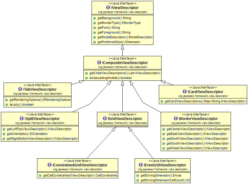
Reference
BasicCompositeViewDescriptor
BasicCompositeViewDescriptor
- Full name :
org.jspresso.framework.view.descriptor.basic.BasicCompositeViewDescriptor - Super-type :
BasicViewDescriptor - Sub-types :
AbstractMobilePageViewDescriptor,BasicBorderViewDescriptor,BasicConstrainedGridViewDescriptor,BasicEvenGridViewDescriptor,BasicSplitViewDescriptor,BasicTabViewDescriptor
This is the abstract base class for all composite views. A composite view is
a view that arranges a collection of nested views in a predefined layout.
Nested views can also be composite views which makes it possible to build
complex UIs out of simple combinations. Composite views are also the
foundation of master-detail views by allowing a nested view to take its model
out of the selection of the previous one. This behaviour can be activated
using the cascadingModels property that "cascades" the
view models based on the selected elements. Whenever this behaviour is not
activated, all nested views share the same model than their parent composite
unless specified otherwise.
| Property | Description |
|---|---|
cascadingModels
|
Enables the model "cascading" behaviour. This allows for instance
to link 2 nested tables where the 2nd table model is the selected row of
the first table (or
Default value is |
horizontallyScrollable
|
This property allows to define the form horizontal scrolling behaviour. Whenever it is set to true, the corresponding UI component will install a horizontal scroll bar when the available horizontal space is not enough.
Default value is |
verticallyScrollable
|
This property allows to define the form vertical scrolling behaviour. Whenever it is set to true, the corresponding UI component will install a vertical scroll bar when the available vertical space is not enough.
Default value is |
AbstractMobilePageViewDescriptor
- Full name :
org.jspresso.framework.view.descriptor.mobile.AbstractMobilePageViewDescriptor - Super-type :
BasicCompositeViewDescriptor - Sub-types :
MobileCardPageViewDescriptor,MobileCompositePageViewDescriptor,MobileNavPageViewDescriptor
Abstract base class for mobile page view descriptors.
| Property | Description |
|---|---|
backAction
|
Sets back action. |
enterAction
|
Sets enter action. |
forClientTypes
|
Sets for client types. |
i18nDescription
|
Sets i 18 n description. |
i18nHeader
|
Sets i 18 n header. |
i18nName
|
Sets i 18 n name. |
mainAction
|
Sets main action. |
pageEndAction
|
Sets page end action. |
position
|
Sets position. |
swipeLeftAction
|
Sets swipe left action. |
swipeRightAction
|
Sets swipe right action. |
MobileCardPageViewDescriptor
- Full name :
org.jspresso.framework.view.descriptor.mobile.MobileCardPageViewDescriptor - Super-type :
AbstractMobilePageViewDescriptor
A card view descriptor that aggregates other pages as card.
| Property | Description |
|---|---|
cascadingModels
|
Sets cascading models. This operation is not supported on mobile pages. |
pagesCardViewDescriptor
|
Sets pages. |
MobileCompositePageViewDescriptor
- Full name :
org.jspresso.framework.view.descriptor.mobile.MobileCompositePageViewDescriptor - Super-type :
AbstractMobilePageViewDescriptor
A composite view descriptor that aggregates view sections on a single page.
| Property | Description |
|---|---|
cascadingModels
|
Sets cascading models. This operation is not supported on mobile pages. |
editorPage
|
Sets editing page. |
inlineEditing
|
Sets inline editing. |
pageSectionDescriptors
|
Sets page sections. |
MobileNavPageViewDescriptor
- Full name :
org.jspresso.framework.view.descriptor.mobile.MobileNavPageViewDescriptor - Super-type :
AbstractMobilePageViewDescriptor
Navigation page view descriptors that are able to navigate to another page based on a selection component.
| Property | Description |
|---|---|
cascadingModels
|
Sets cascading models. This operation is not supported on mobile lists. |
headerSectionDescriptors
|
Sets header section descriptors. |
nextPageViewDescriptor
|
Sets next page. |
selectionViewDescriptor
|
Sets selection view. Supports only tree or list. |
BasicBorderViewDescriptor
- Full name :
org.jspresso.framework.view.descriptor.basic.BasicBorderViewDescriptor - Super-type :
BasicCompositeViewDescriptor - Sub-types :
MobileBorderViewDescriptor
A border view is a composite view that arranges its children to the north, west, east, south and center. Depending its position in the container, the resizing rules apply differently :
- north and south are resized horizontally and kept to their preferred size vertically
- west and east are resized vertically and kept to their preferred size horizontally
- center is resized both horizontally and vertically
north -> west -> center -> east -> south
| Property | Description |
|---|---|
centerViewDescriptor
|
Sets the child view to layout in the center zone. The child view will be resized both horizontally and vertically. |
eastViewDescriptor
|
Sets the child view to layout in the east zone. The child view will be resized vertically. |
northViewDescriptor
|
Sets the child view to layout in the north zone. The child view will be resized horizontally. |
southViewDescriptor
|
Sets the child view to layout in the south zone. The child view will be resized horizontally. |
westViewDescriptor
|
Sets the child view to layout in the west zone. The child view will be resized vertically. |
MobileBorderViewDescriptor
- Full name :
org.jspresso.framework.view.descriptor.mobile.MobileBorderViewDescriptor - Super-type :
BasicBorderViewDescriptor
A composite view descriptor that aggregates mobile views.
| Property | Description |
|---|---|
backAction
|
Sets back action. |
eastViewDescriptor
|
Not supported in mobile environment. {@inheritDoc} |
enterAction
|
Sets enter action. |
forClientTypes
|
Sets for client types. |
i18nHeader
|
Sets i 18 n header. |
mainAction
|
Sets main action. |
pageEndAction
|
Sets page end action. |
position
|
Sets position. |
swipeLeftAction
|
Sets swipe left action. |
swipeRightAction
|
Sets swipe right action. |
westViewDescriptor
|
Not supported in mobile environment. {@inheritDoc} |
BasicConstrainedGridViewDescriptor
- Full name :
org.jspresso.framework.view.descriptor.basic.BasicConstrainedGridViewDescriptor - Super-type :
BasicCompositeViewDescriptor
This composite view arranges its children in a grid where cell behaviour and dimensions are configured using cell constraints. A cell constraint is a simple data structure holding the following properties :
row: the row to which the cell belongscolumn: the column to which the cell belongswidth: the number of columns the cell spans horizontally (default value is 1)height: the number of rows the cell spans vertically (default value is 1)heightResizable: whether the cell should be resized to take all the available space verticallywidthResizable: whether the cell should be resized to take all the available space horizontally
| Property | Description |
|---|---|
cells
|
Registers the nested children views along with their cell constraints. They
are set as a
|
BasicEvenGridViewDescriptor
- Full name :
org.jspresso.framework.view.descriptor.basic.BasicEvenGridViewDescriptor - Super-type :
BasicCompositeViewDescriptor - Sub-types :
MobileEvenGridViewDescriptor
This composite view arranges its children in a grid where cells are distributed evenly. All cells are resized horizontally and vertically to fill its available space.
The number of cells in a row / column is determined by the combination of the
drivingDimension and drivingDimensionCellCount
properties. the cells are spread along the driving dimension (row or column)
until the maximum number of cells in the dimension has been reached. Then a
new row (or column) is added. The process repeats until all the cells have
been added.
This container does not allow for individual cell configuration like
row/column spanning. Whenever cell disposition has to be customized more
finely, a BasicConstrainedGridViewDescriptor should be used
instead.
Default cascading order follows the order of nested view registrations in the container.
| Property | Description |
|---|---|
cells
|
Registers the nested views to display as grid cells. |
drivingDimension
|
Configures the driving dimension of the grid. This is either a value of the
EAxis.ROW, i.e. distribute cells along rows
then columns. |
drivingDimensionCellCount
|
This property configures the maximum number of cells in the driving dimension (row or column). Nested views are distributed along the driving axis until this maximum number has been reached. A new row or column is then created to host the remaining cells. |
MobileEvenGridViewDescriptor
- Full name :
org.jspresso.framework.view.descriptor.mobile.MobileEvenGridViewDescriptor - Super-type :
BasicEvenGridViewDescriptor
A composite view descriptor that aggregates mobile views.
| Property | Description |
|---|---|
backAction
|
Sets back action. |
drivingDimension
|
Not supported in mobile environment. {@inheritDoc} |
drivingDimensionCellCount
|
Not supported in mobile environment. {@inheritDoc} |
enterAction
|
Sets enter action. |
forClientTypes
|
Sets for client types. |
i18nHeader
|
Sets i 18 n header. |
mainAction
|
Sets main action. |
pageEndAction
|
Sets page end action. |
position
|
Sets position. |
swipeLeftAction
|
Sets swipe left action. |
swipeRightAction
|
Sets swipe right action. |
BasicSplitViewDescriptor
- Full name :
org.jspresso.framework.view.descriptor.basic.BasicSplitViewDescriptor - Super-type :
BasicCompositeViewDescriptor
This composite view arranges its children in a container split either horizontally or vertically. An horizontal split disposes its 2 children left and right whereas a vertical split disposes its 2 children top and bottom. The dividing bar can typically be moved by the user to distribute the available space.
Default cascading order for master-detail is :
left -> right or top -> bottom depending on the split orientation.
| Property | Description |
|---|---|
leftTopViewDescriptor
|
Sets the left (horizontal split) of top (vertical split) nested view. |
orientation
|
Configures the split orientation of the container. This is either a value
of the
EOrientation.VERTICAL, i.e. the container is
split vertically. |
rightBottomViewDescriptor
|
Sets the right (horizontal split) of bottom (vertical split) nested view. |
separatorPosition
|
Sets separator position. |
BasicTabViewDescriptor
- Full name :
org.jspresso.framework.view.descriptor.basic.BasicTabViewDescriptor - Super-type :
BasicCompositeViewDescriptor - Sub-types :
MobileTabViewDescriptor
This composite view arranges its children in tabs. Each tab potentially displays a label (that is translated based on the name of the view in the tab), an icon (based on the icon of the view in the tab) and a toolTip (based on the description of the view in the tab).
Default cascading order follows the order of nested view registrations in the container.
| Property | Description |
|---|---|
lazy
|
When set to true, this parameter configures the tabs to be lazy bound
(binding occurs only for the selected tab). This feature is only supported
for tab views with |
renderingOptions
|
Indicates how the tabs should be rendered. This is either a value of the
Default value is |
selectFirstTab
|
If |
tabSelectionAction
|
Registers an action that is implicitly triggered every time the tab selection changes on the tab view UI peer. The context of the action execution is the same as if the action was registered in the view action map. |
tabs
|
Registers the list of views to be displayed as tabs. The tabs order follows the children views order of this list. |
MobileTabViewDescriptor
- Full name :
org.jspresso.framework.view.descriptor.mobile.MobileTabViewDescriptor - Super-type :
BasicTabViewDescriptor
A composite view descriptor that aggregates mobile views.
| Property | Description |
|---|---|
carouselMode
|
Sets carousel mode. |
cascadingModels
|
Not supported in mobile environment. {@inheritDoc} |
forClientTypes
|
Sets for client types. |
position
|
Sets position. |